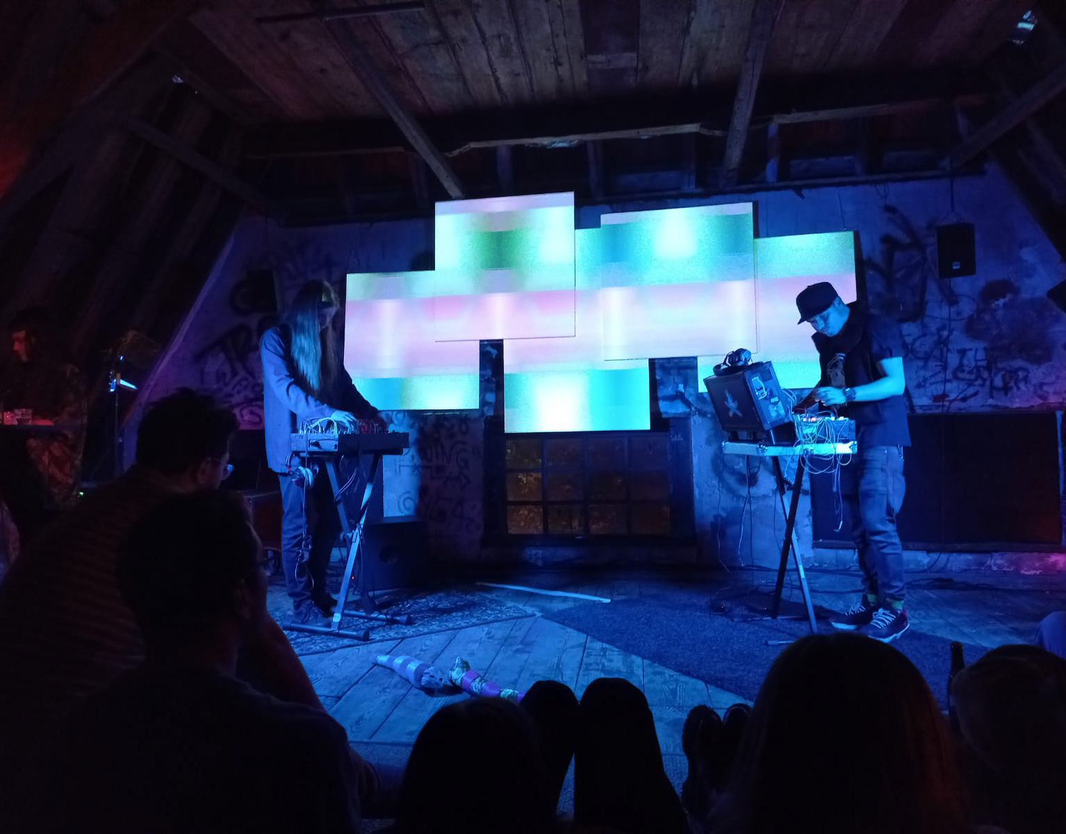


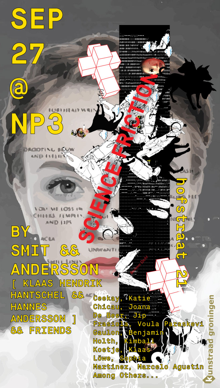
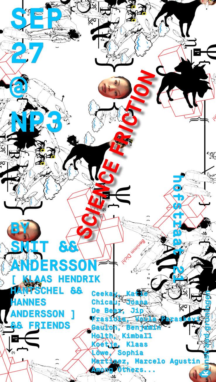
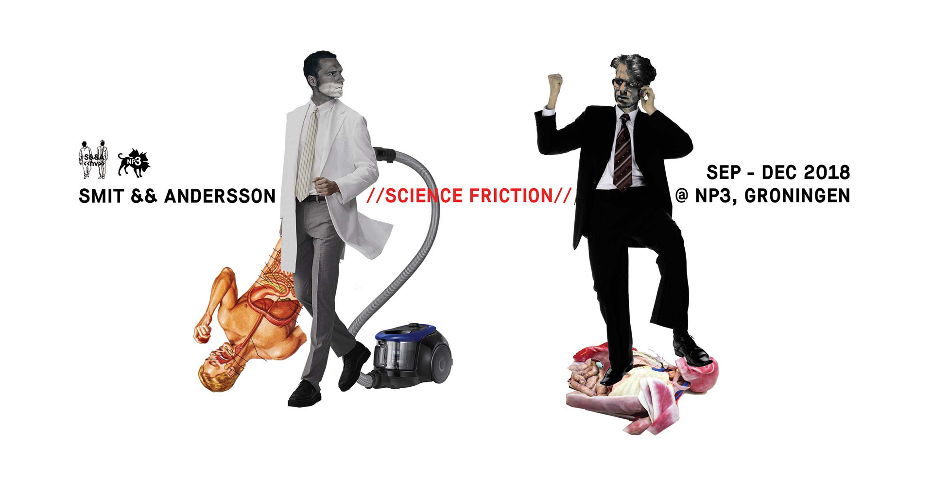
Science Friction was a 3-month long “research-installation” & event program focusing on the concept of ‘Social Network’ held in 2018, organized by myself in collaboration with Klaas Hendrik Hantschel under the name SMIT&&ANDERSSON at BYR0 Groningen, in Groningen (Netherlands), for which I produced some of my favorite graphic design works to date.
If you wish to know more about the project in general you can read about it here, as in this entry I will mainly focus on aspects relevant to the project’s aesthetics and design.
To give you some context: the general idea of Science Friction was to engage with the concept of the social network in a critical, collaborative, light-hearted & constructive way. We were asking questions such as: are the social networks we use really social? Or are they actually better described as anti-social in terms of the realities they produce? Wasn’t the internet supposed to be some sort of hippie utopia? What happened to that?
To be fair, it is hard to build a hippie utopia using military technology, but still. Where did it “go wrong”? What happened?
To be fair, it is hard to build a hippie utopia using military technology, but still. Where did it “go wrong”? What happened?
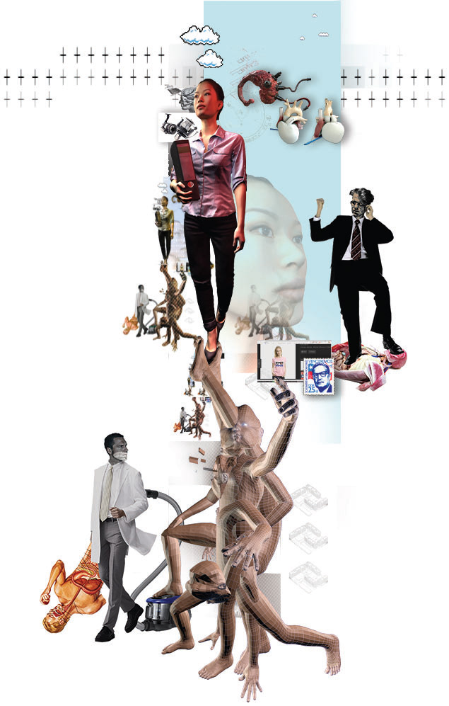
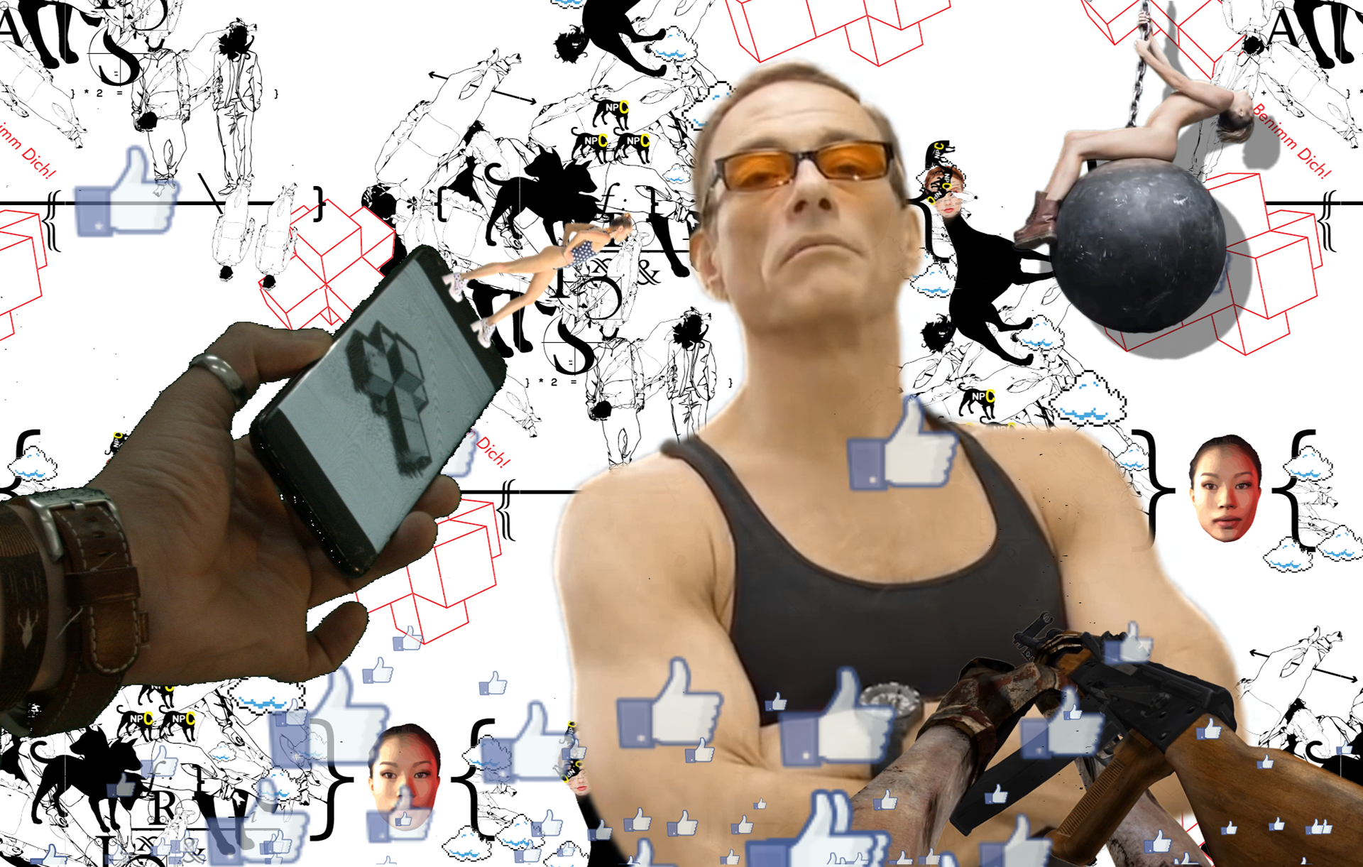
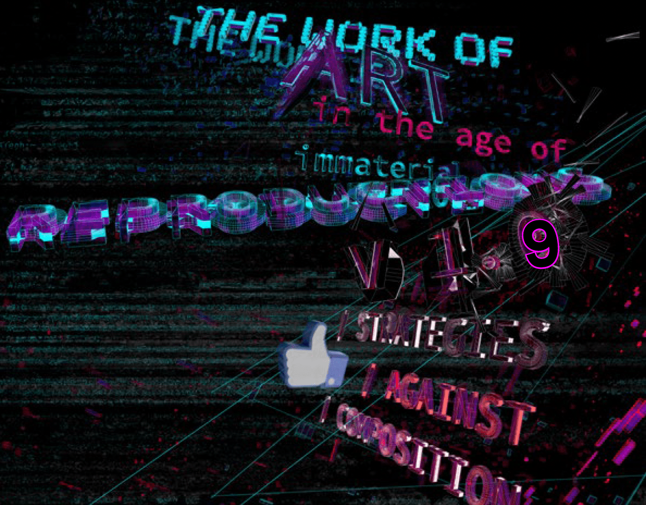
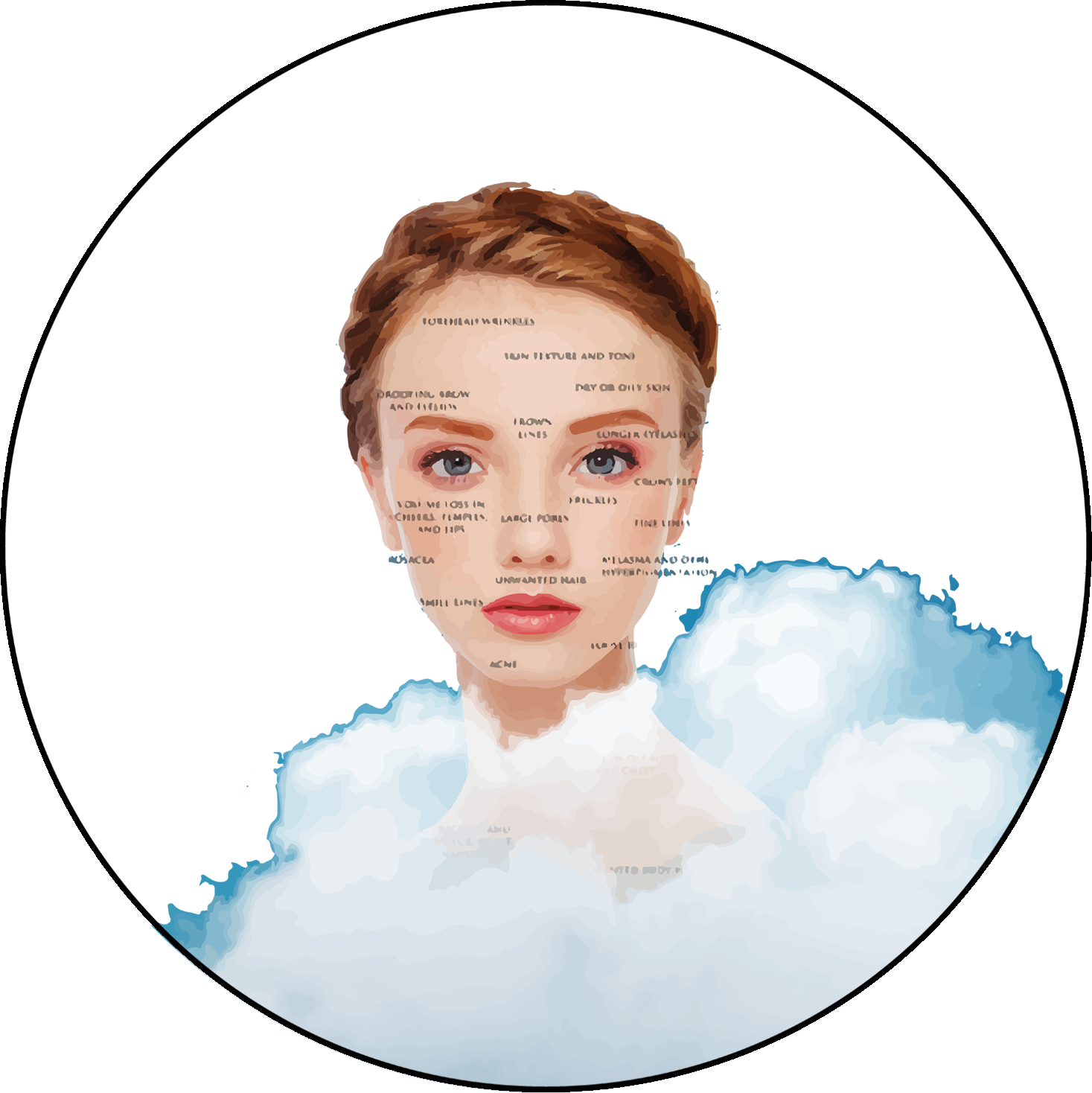
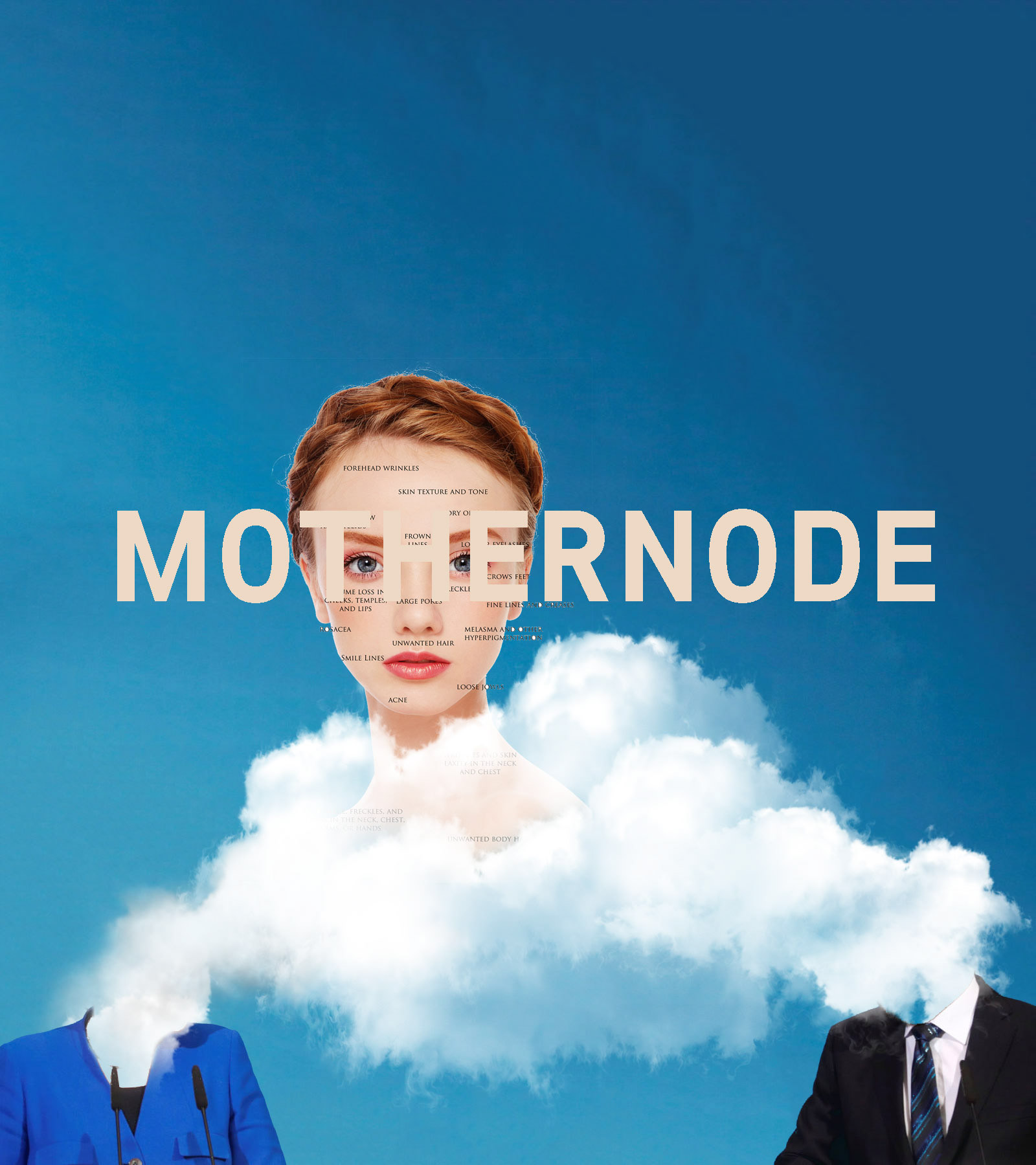
Aesthetically, I wanted the graphic material related to the project to embody these questions, and their inherent contradictions. I wanted to achieve a look and feel of web 2.0 from the point of view of the cyberneticists of the 70’s and early 80’s, as the failed techno-utopia.
A web 2.0 running on 80’s architecture: the aesthetics of a cyberpunk Instagram, let’s say.
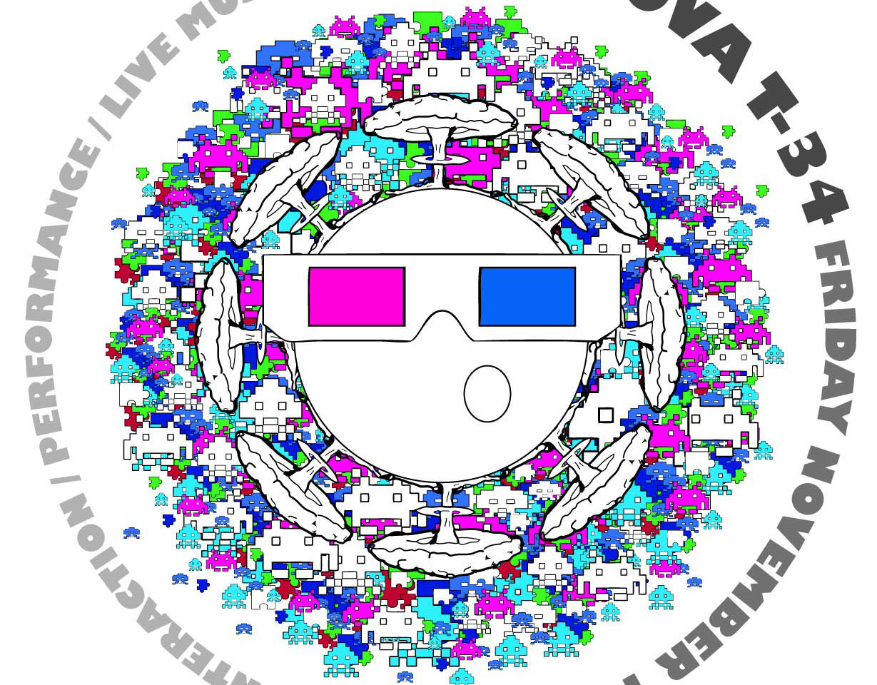
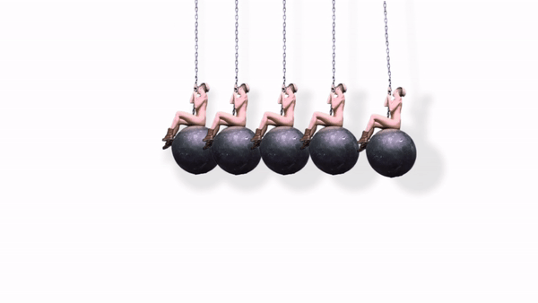
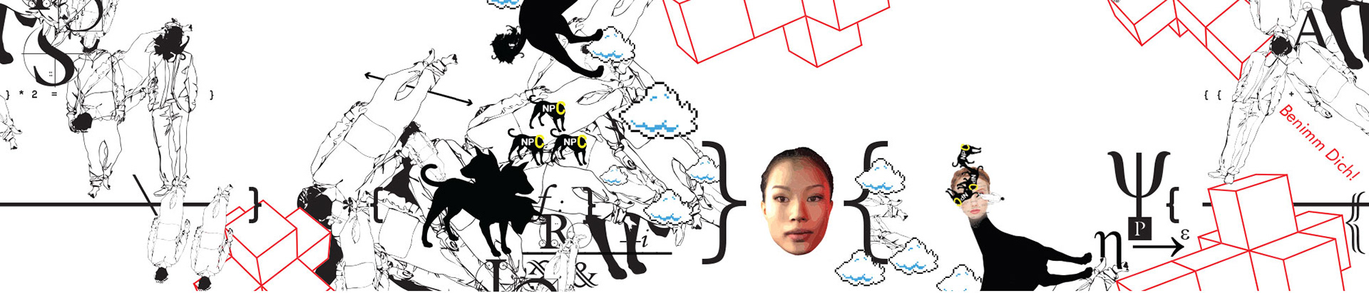
Consequently, the aesthetics the Science friction design is something of “a Retro-futuristic mish-mash”, inspired by the quick-and-dirty designs of meme culture, the world according to advertisement and Photoshop 1.
Somewhere between Facebook and Neuomancer.
Did androids dream of electric ads?
Did androids dream of electric ads?

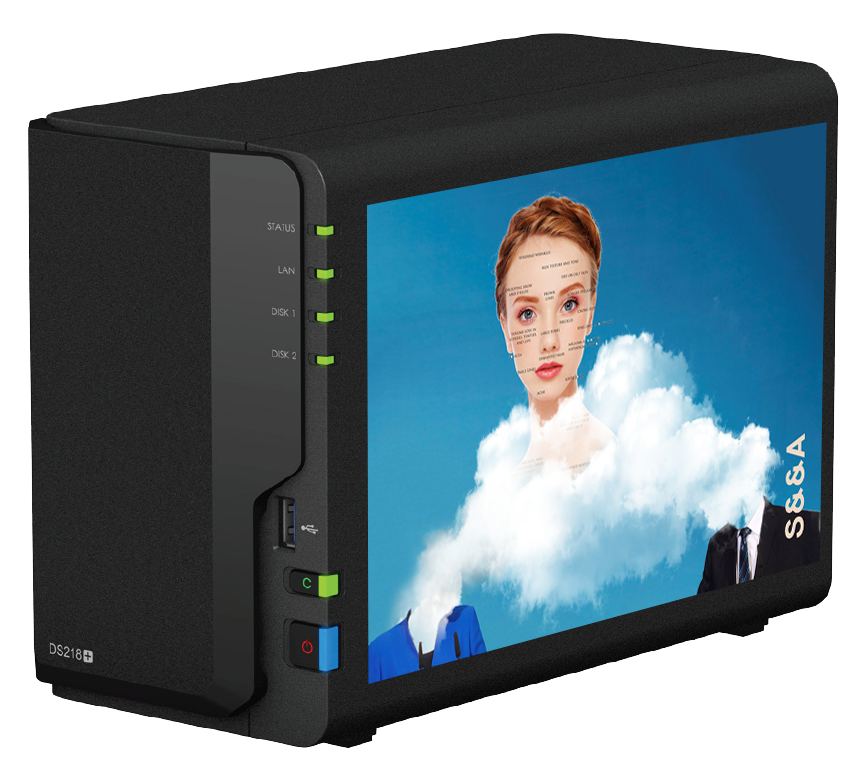
The Mothernode (A NAS Server which was powering our local library)
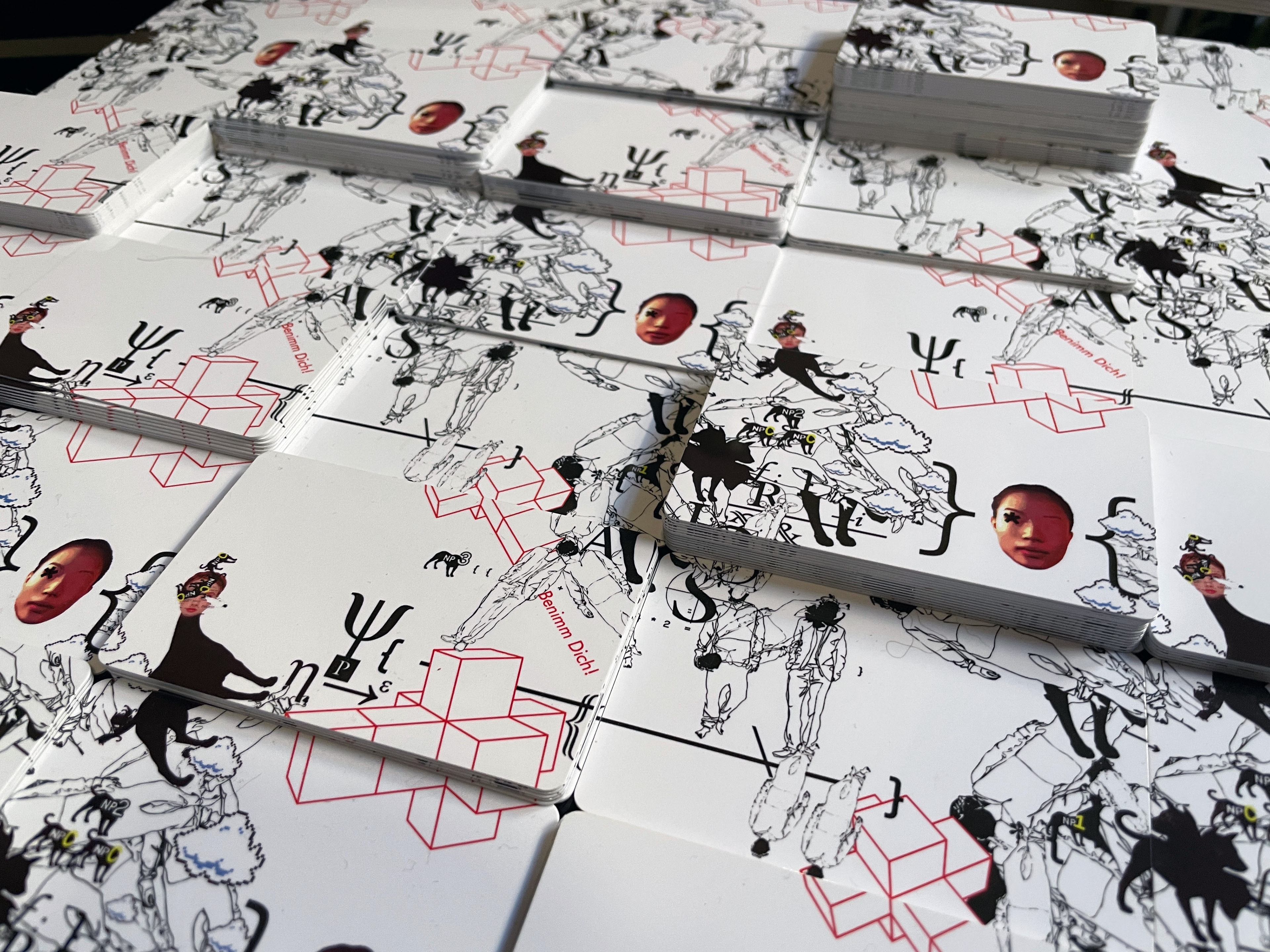
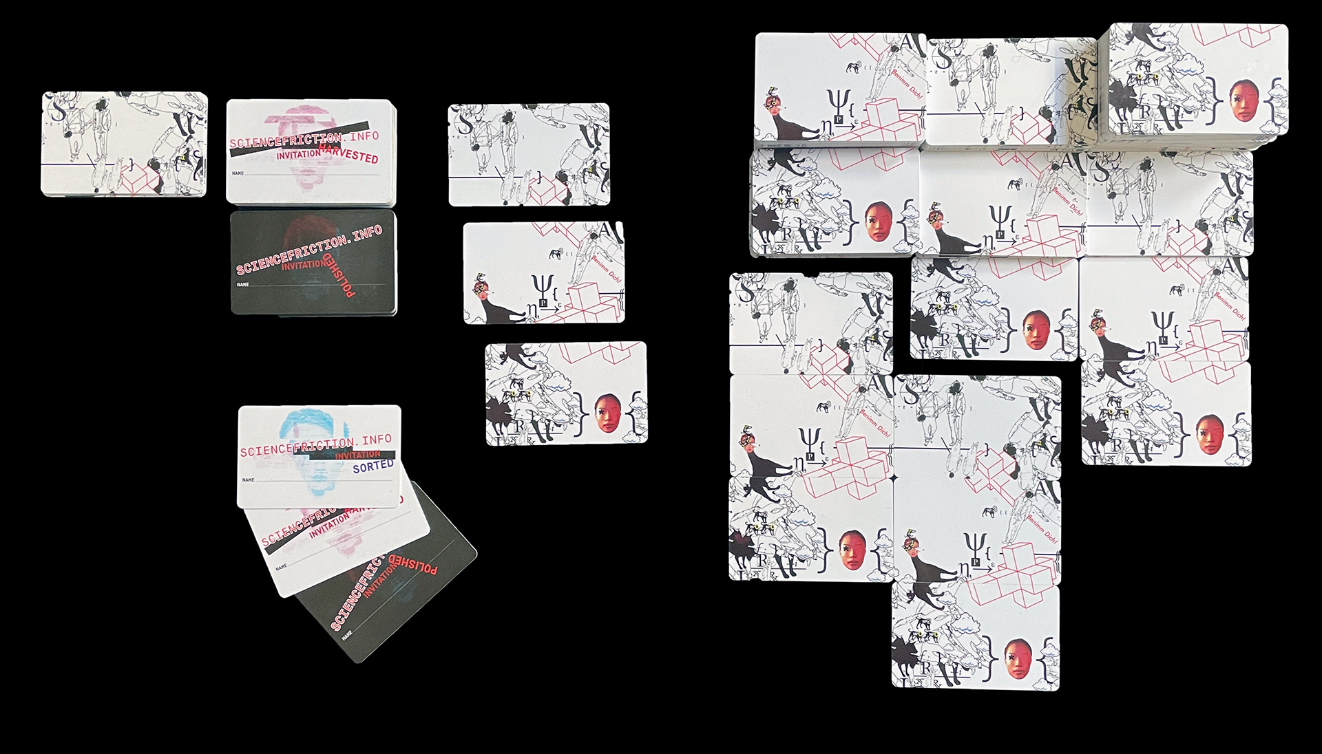
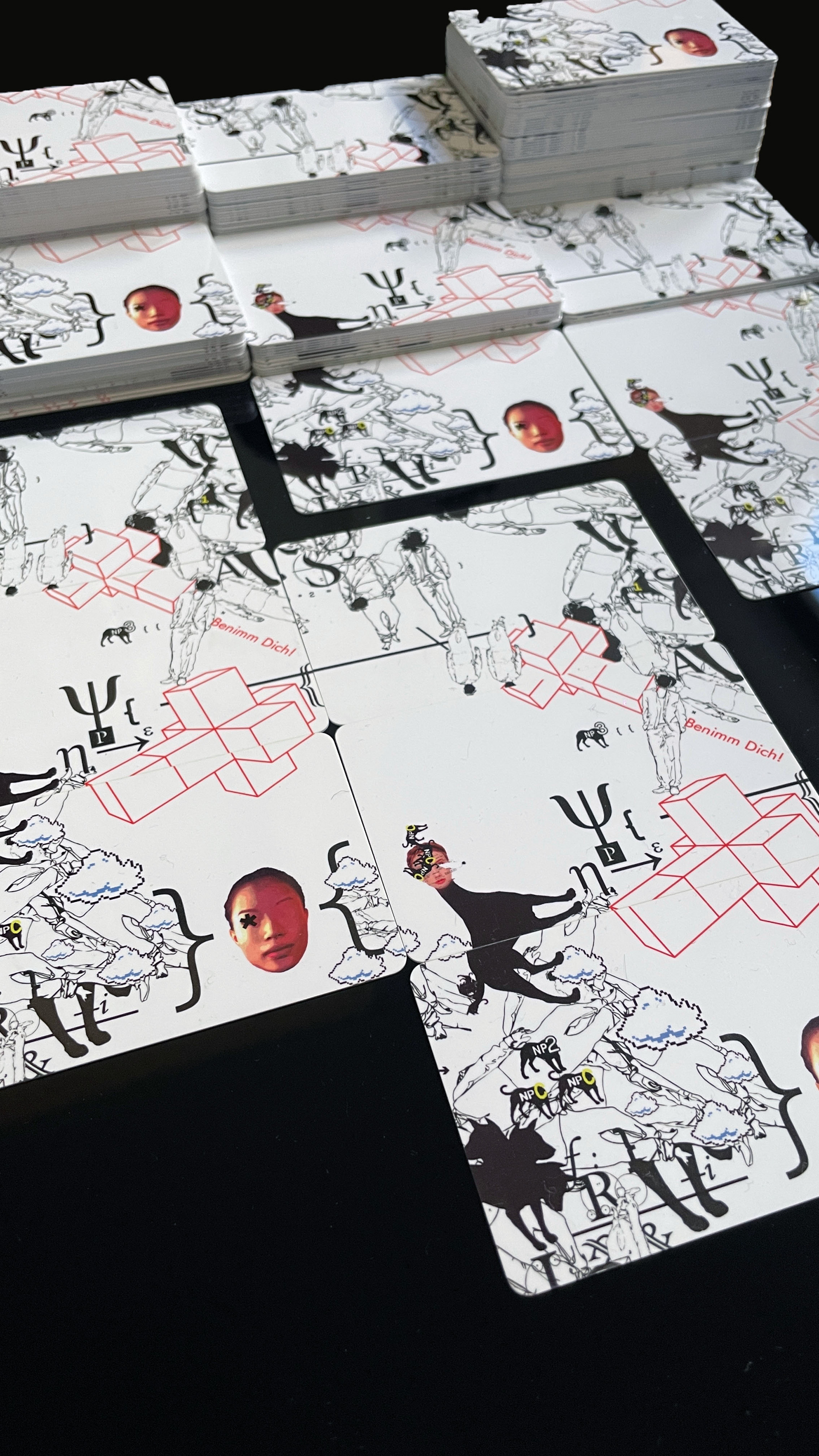
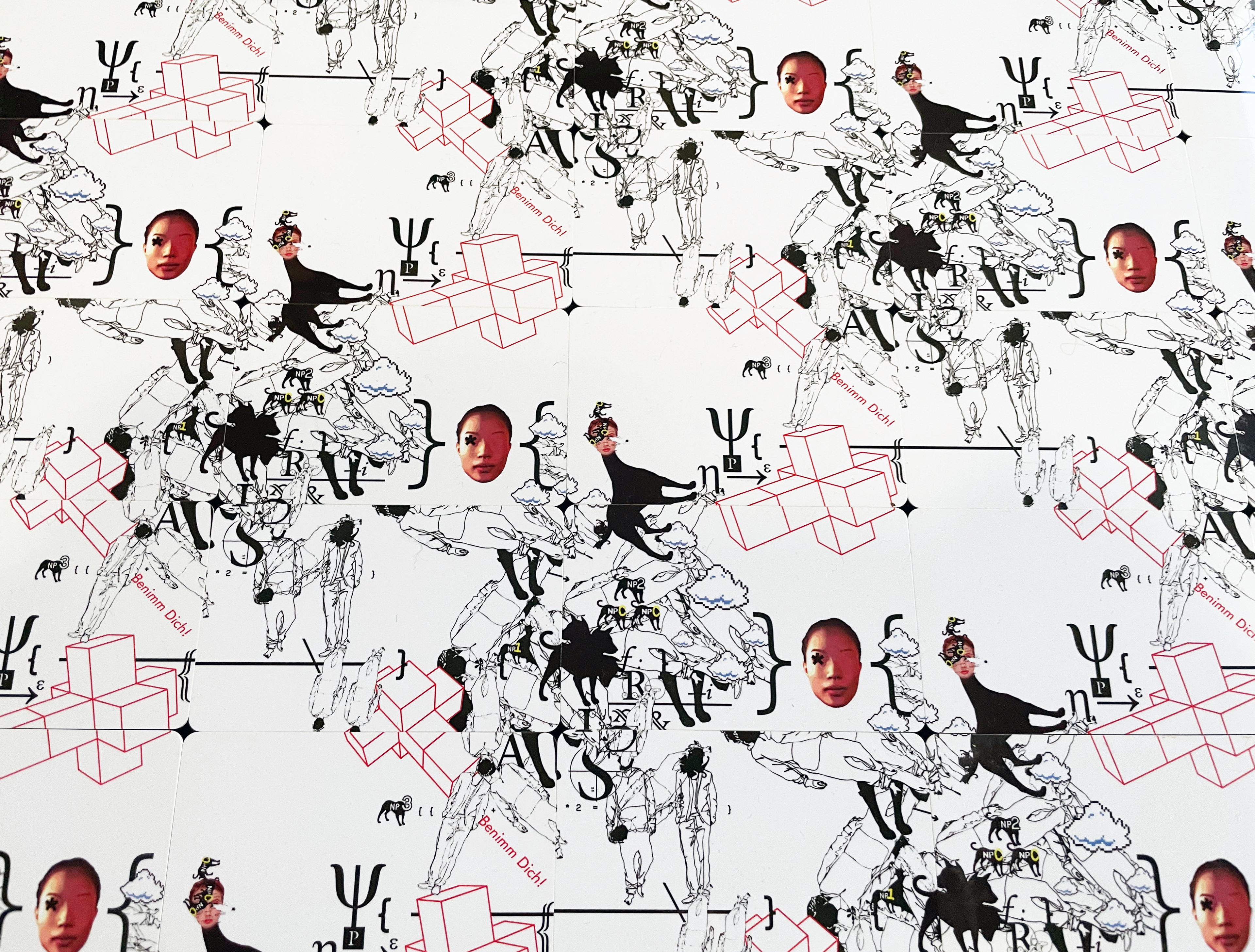
The Cards
We wanted to make invitations that felt personal, so instead of giving out flyers we decided to make "membership cards", where a space was given for the receiver to sign their name on the backside.
In order to illustrate that each attendant was individual, yet a part of the larger whole, I landed on the idea to make the cards 'modular' in the sence that they would stack up to form a larger image pattern.